Package Design
Space Scope
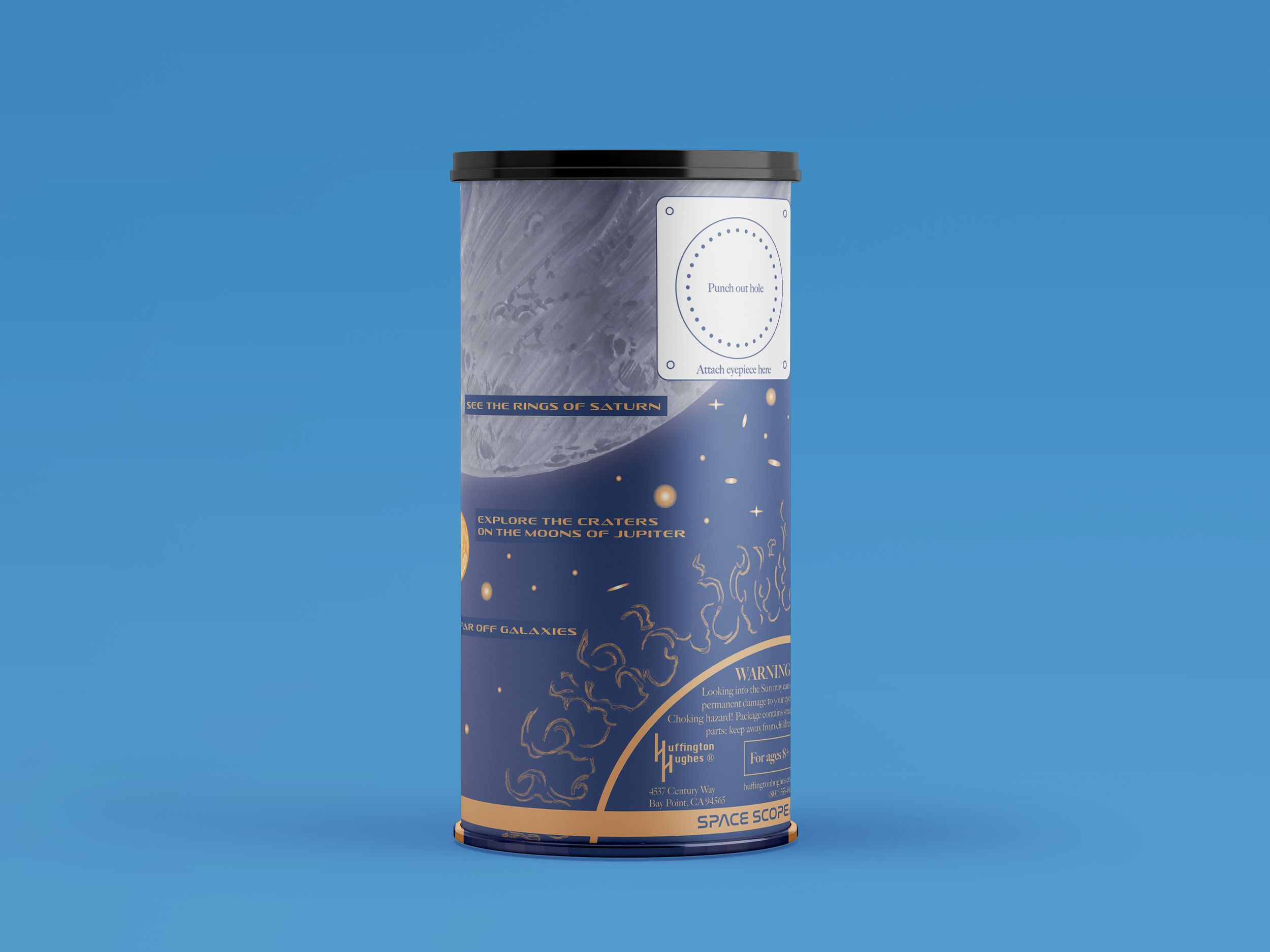
Designing for a cylinder is no easy feat. While the layout may be a simple rectangle, figuring out how the design wraps around a curved surface presents a unique challenge—and one I was excited to take on.
I thought, how cool would it be to design a telescope that you build yourself? To me, a cylinder immediately brings to mind a telescope—and I love telescopes. I used my personal telescope as inspiration for this project, and of course, the typefaces needed to reflect a space-themed aesthetic.
For the logo, I chose Nasalization, the same futuristic typeface used by NASA—perfect for evoking a sense of discovery and innovation. For the descriptions and product text, I used Sofachrome, which gives off a Star Trek-inspired, sci-fi feel. To add some contrast and personality, I selected Big Caslon CC for the warning label. With its strong serifs, Caslon adds a slightly rugged, “space cowboy” vibe that balanced the sleekness of the other type.
The color palette is simple but effective: a deep, dark blue to represent space, and yellow for the sun and stars. Together, these choices help create a cohesive, imaginative packaging experience that speaks to curiosity, wonder, and fun.