Personal Brand
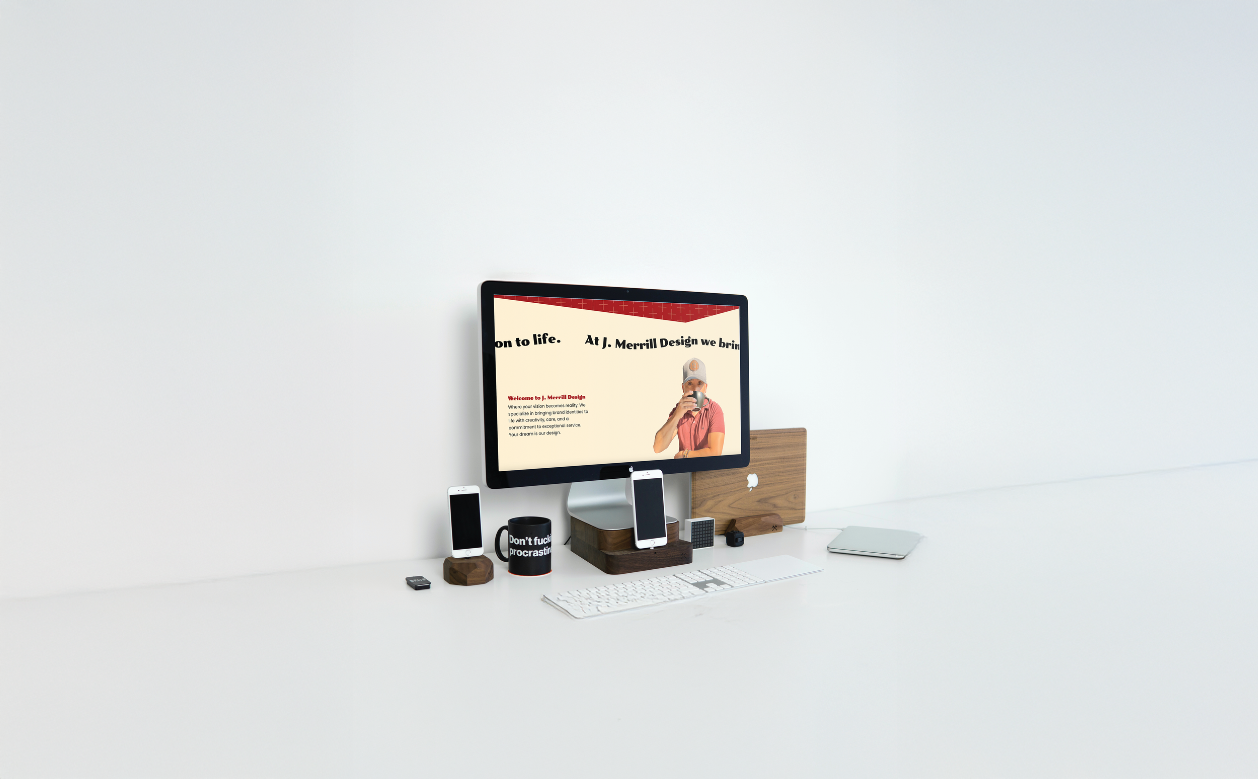
J. Merrill Design came to life when I realized I wanted something more creative out of life. My personality is fun and playful with a touch of sophistication, and I wanted my brand to reflect that balance. I have a deep appreciation for fine craftsmanship, so I kept that in mind when designing my logo.
The result is a geometrically structured monogram paired with a modified script version of Subway Paris—a typeface that brings in the sense of playfulness I was looking for. My name, J. Merrill, fits seamlessly into that tone, bridging structure and creativity.
The brand colors—red, beige, and black—are a combination I love. They feel timeless, bold, and refined, which reflect my personal style perfectly.


We’re more than just a label


